Design Snippets is an educational mini-series of blog posts describing all you need to know about basic elements and components of user interfaces from a design perspective.
A snippet is a programming term for a small region of re-usable source code, machine code, or text.
In the fourth part of our series, we’ll discuss checkboxes, a user interface component that allows users to select none, only one, or any amount of items from a set. In addition, each checkbox works independently from the rest in the list, which means checking an additional box doesn’t affect any of the other previous selections. Read further to find out where and how to use them.
Overview and Structure
The checkbox component consists of a checkbox input and a checkbox label. If there is a group of multiple checkboxes, a group label can be added above.
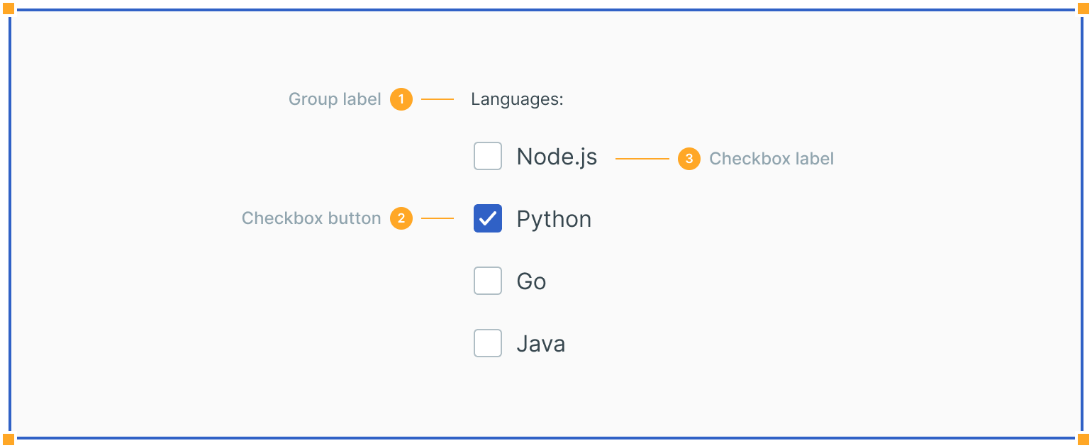
1. Group Label
Describes the options or guides the selection-making process.
2. Checkbox Input
A checkbox input should indicate the appropriate state. By default, it is unselected.
3. Checkbox Label
Describes the information you want to select or unselect. Be explicit about the results that will follow if the checkbox is selected.
States
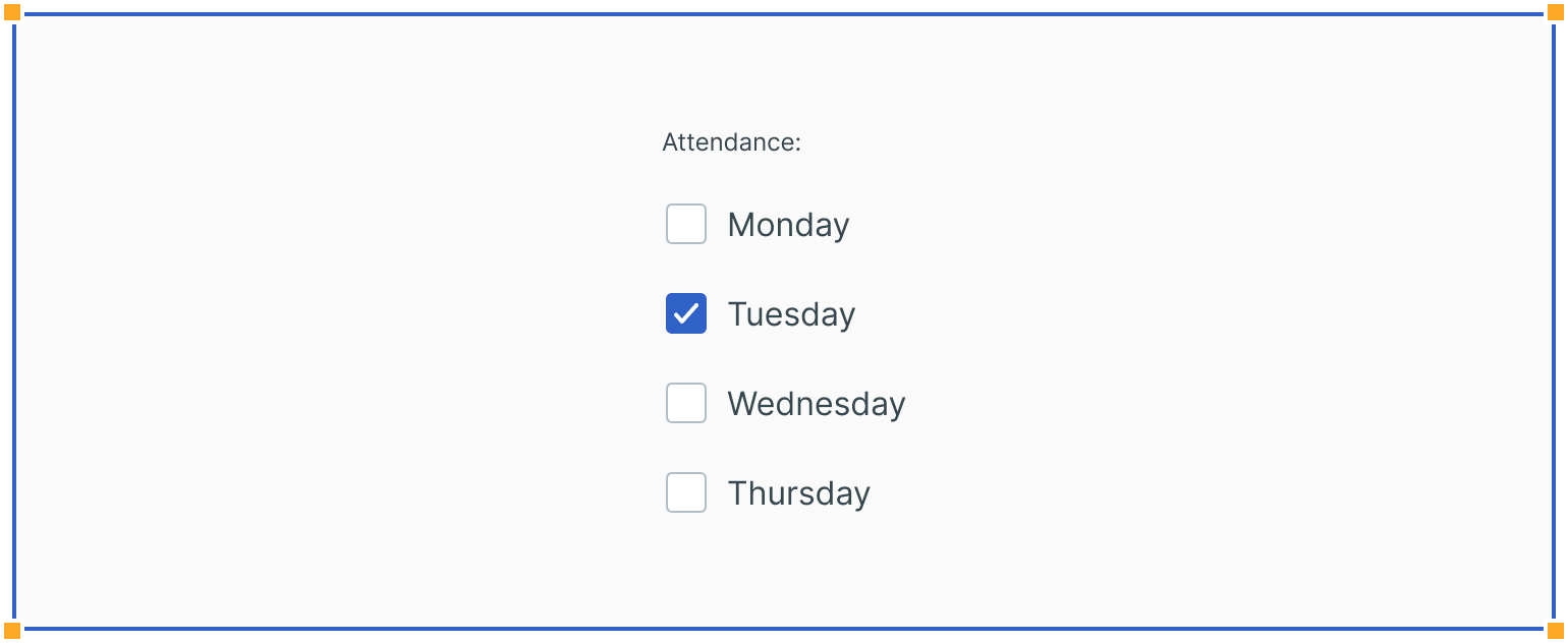
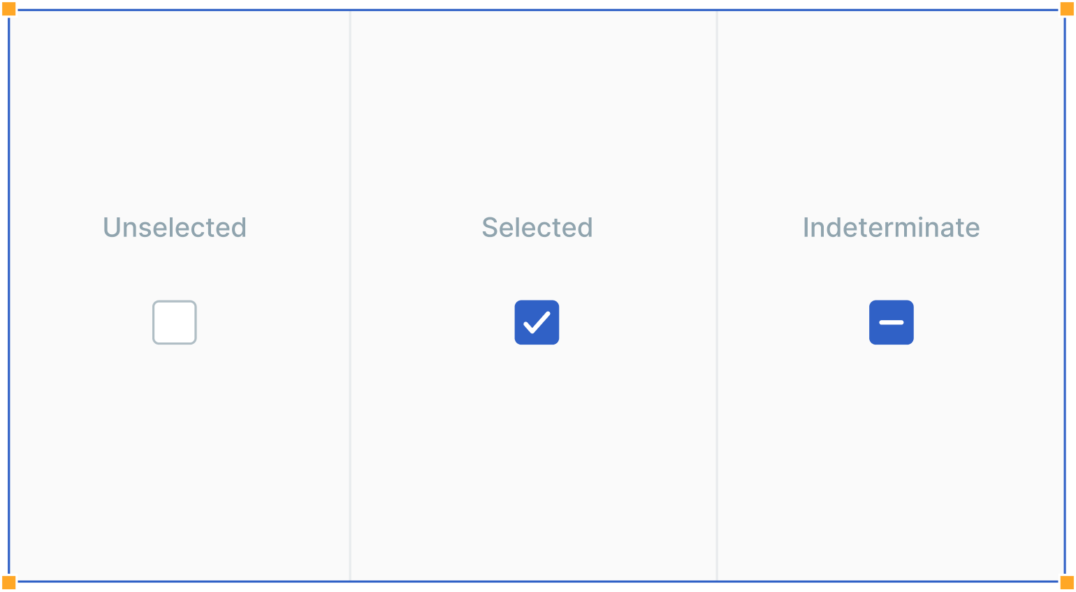
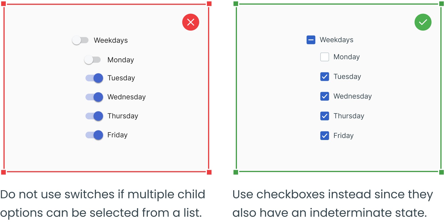
Checkboxes can show a variety of states: unselected, selected, and indeterminate. The default view of a set of checkboxes is having no options selected. If the sublist of selections contains a list where some options are chosen and some aren't, use the indeterminate state.
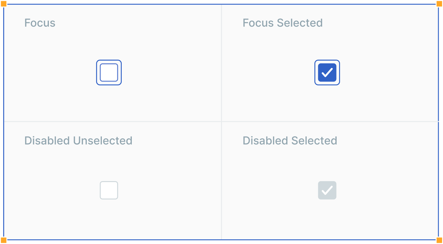
In addition to unselected, selected, and indeterminate states, checkboxes also have focus and disabled states.
Interactions
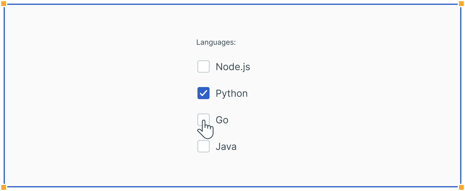
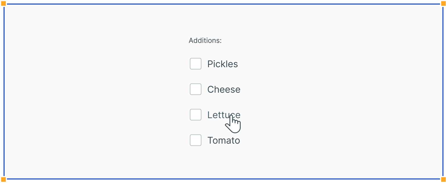
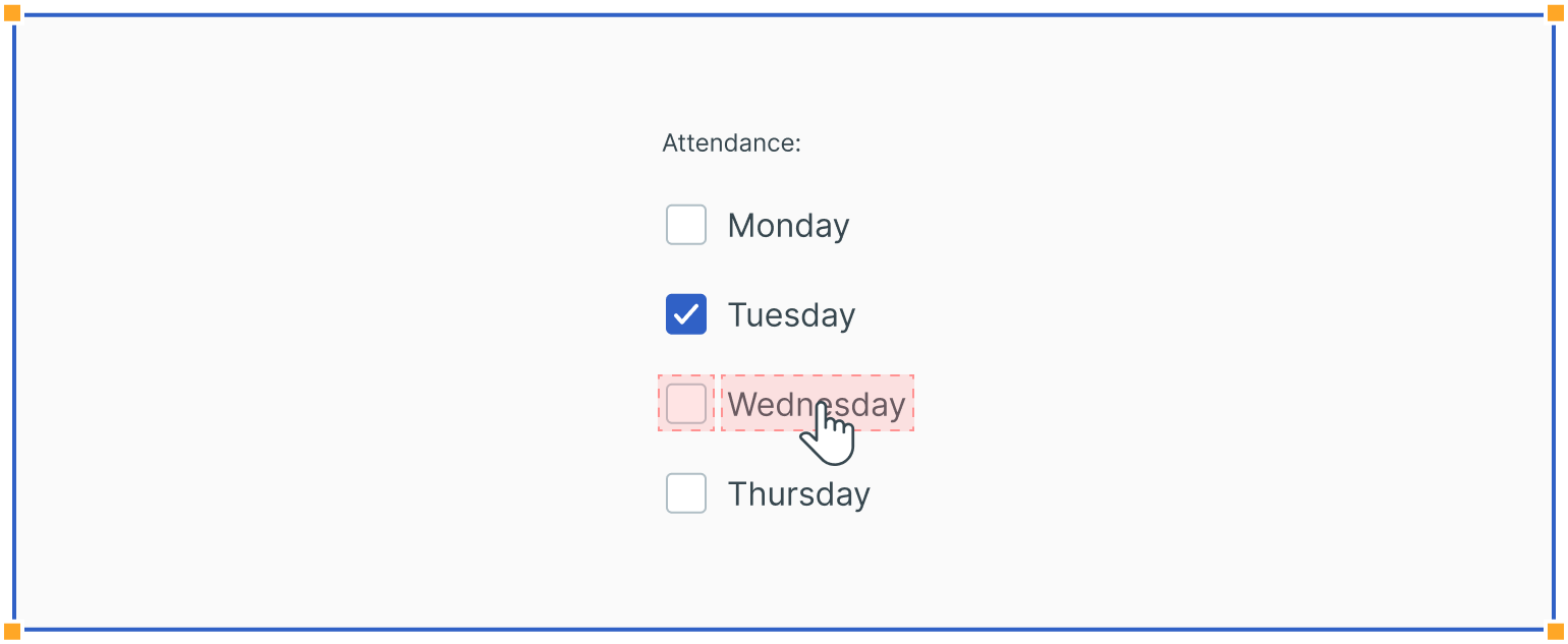
Users can trigger an item by clicking the checkbox input directly or clicking the checkbox label. Having both regions interactive creates a more accessible click target.
Nesting
Checkboxes can also be nested. If so, users can select an entire set of options or only some of them. In addition, checking the master checkbox selects all nested options, while unchecking the master checkbox automatically deselects all nested options.
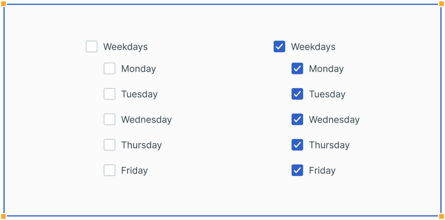
If at least one nested option is unselected, this puts the master checkbox into the indeterminate state.
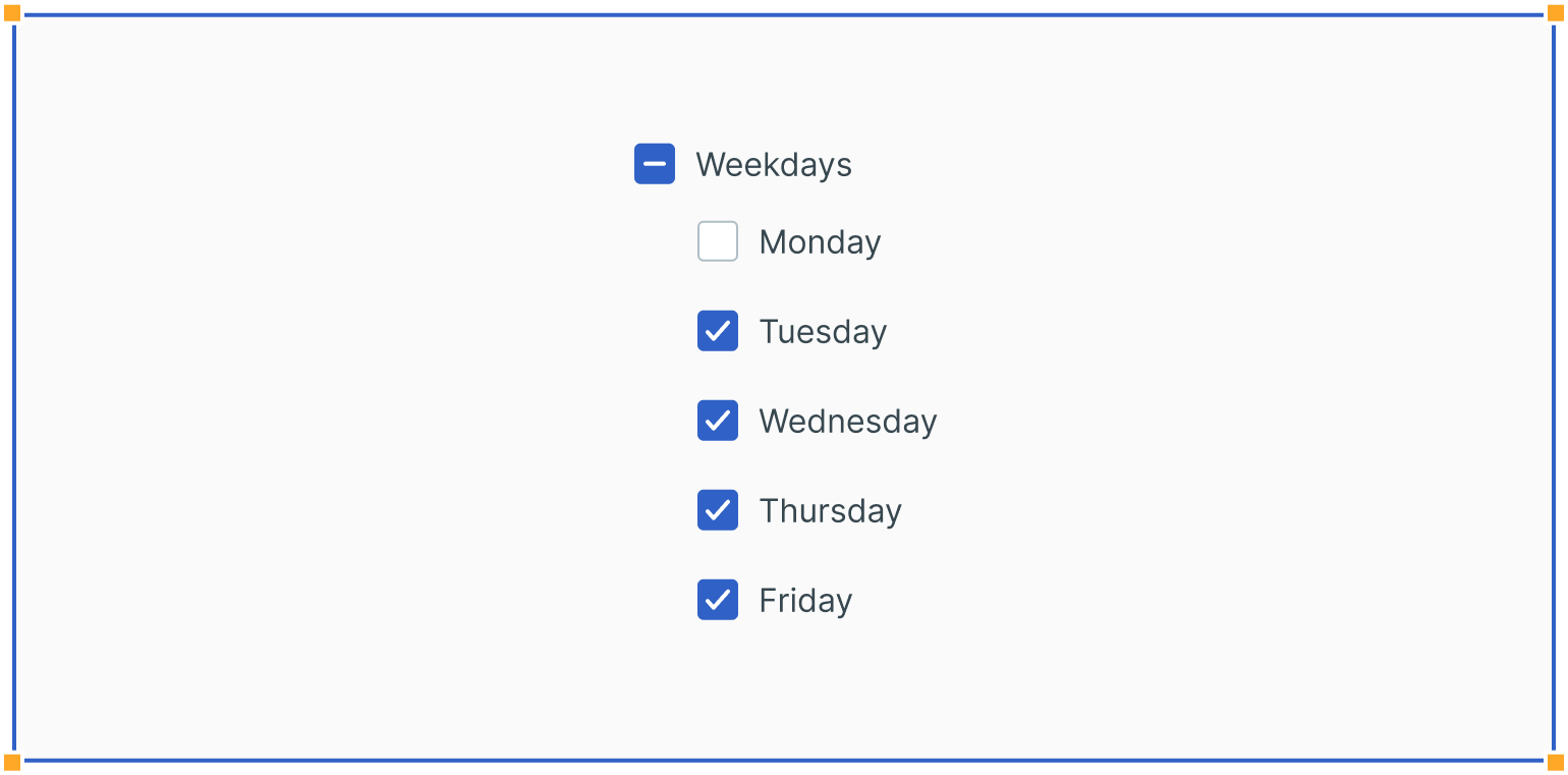
Usage
Single Selections
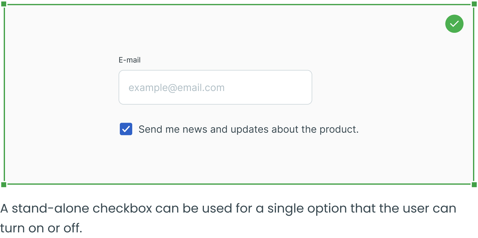
A checkbox may be used to make single selections – such as true or false statements (e.g. “I accept the Terms & Conditions”).
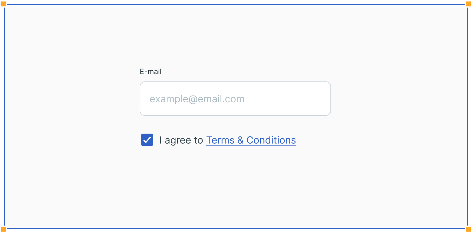
Filters
Checkboxes can be used in combo boxes when filtering across multiple options inside dropdowns.
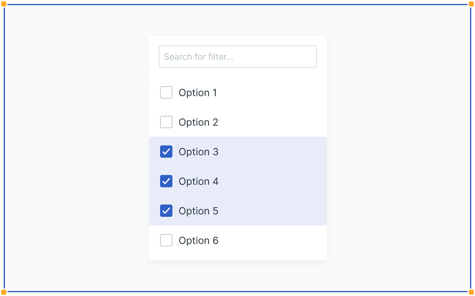
Lists
Checkboxes are commonly used inside forms, where users can select one or more options from a list of related items.
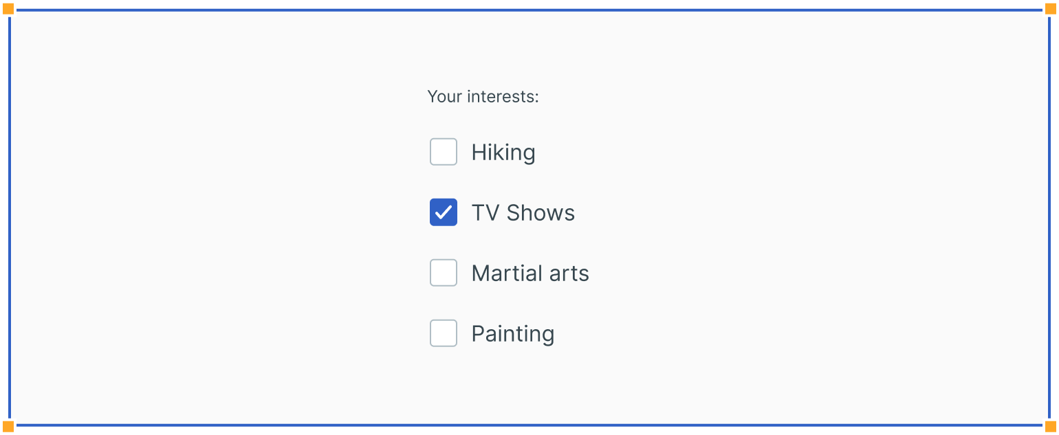
Data Tables
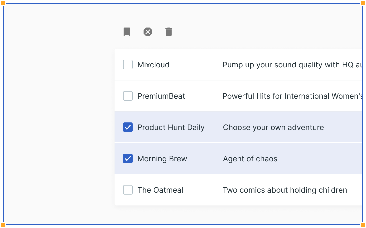
Checkboxes can also be used inside data tables, where users can select multiple items and then apply specific actions only to those items.
Permissions
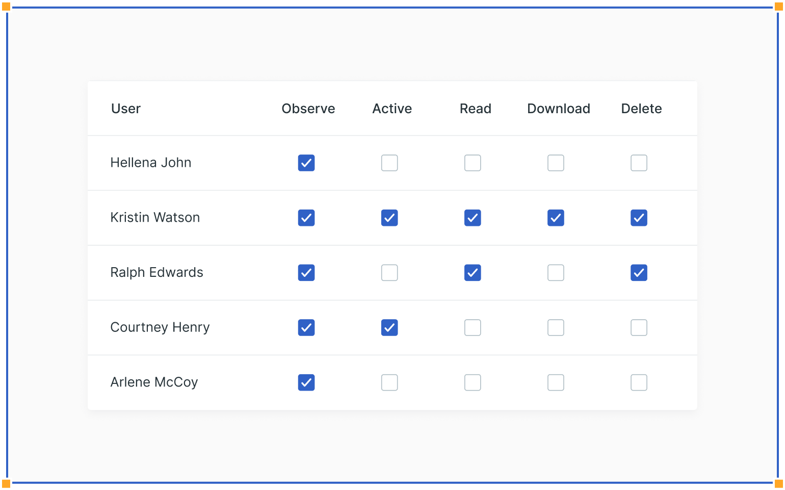
Checkboxes are often used inside user settings, where administrators can handle permissions for each specific user. Such a table is called a permission matrix.
Guidelines
Here are some examples of how to use checkboxes and what to avoid.
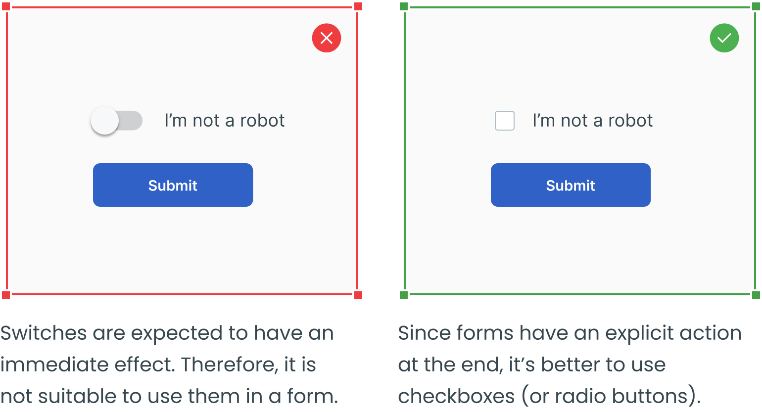
Checkbox vs. Switch
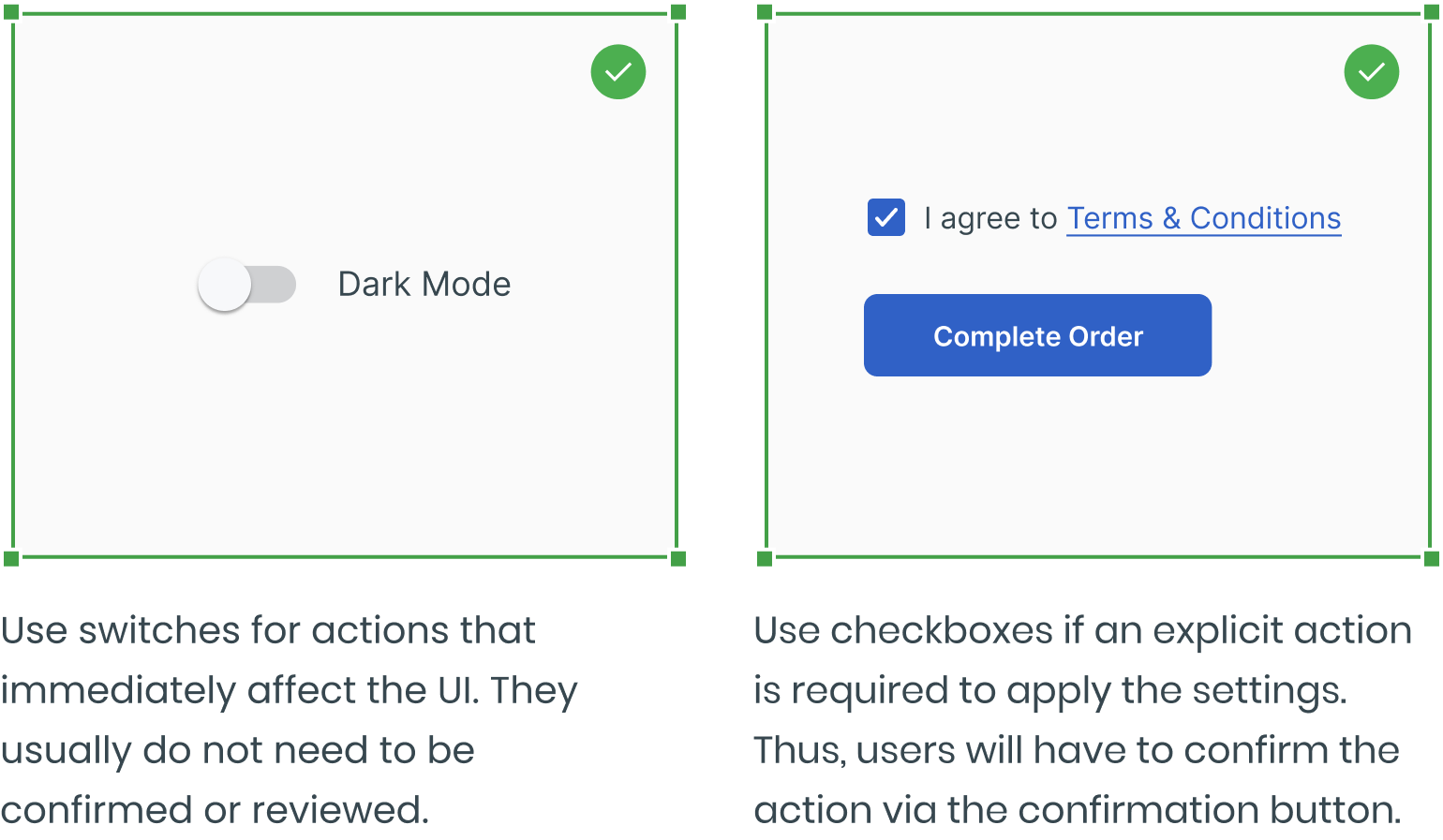
Avoid Switches in Forms
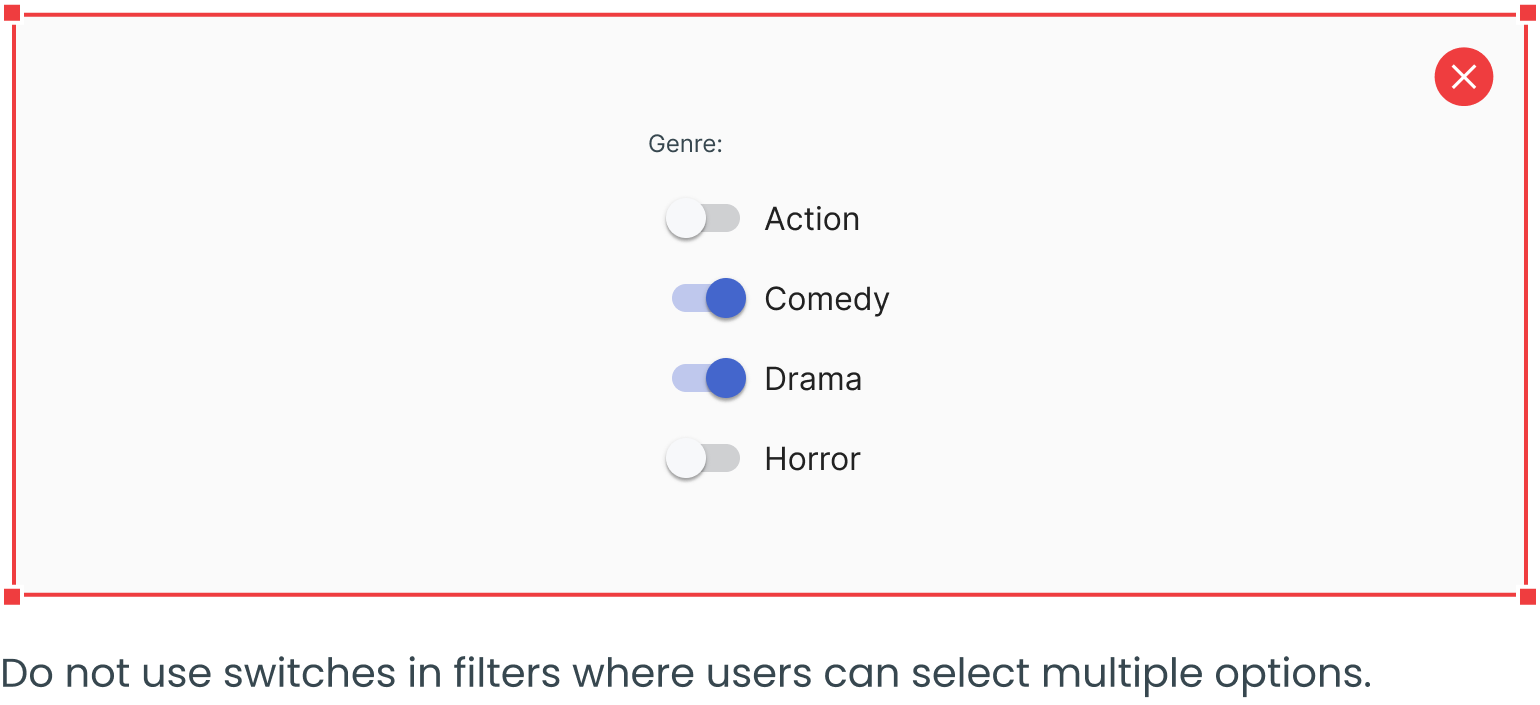
Avoid Switches in Filter Lists
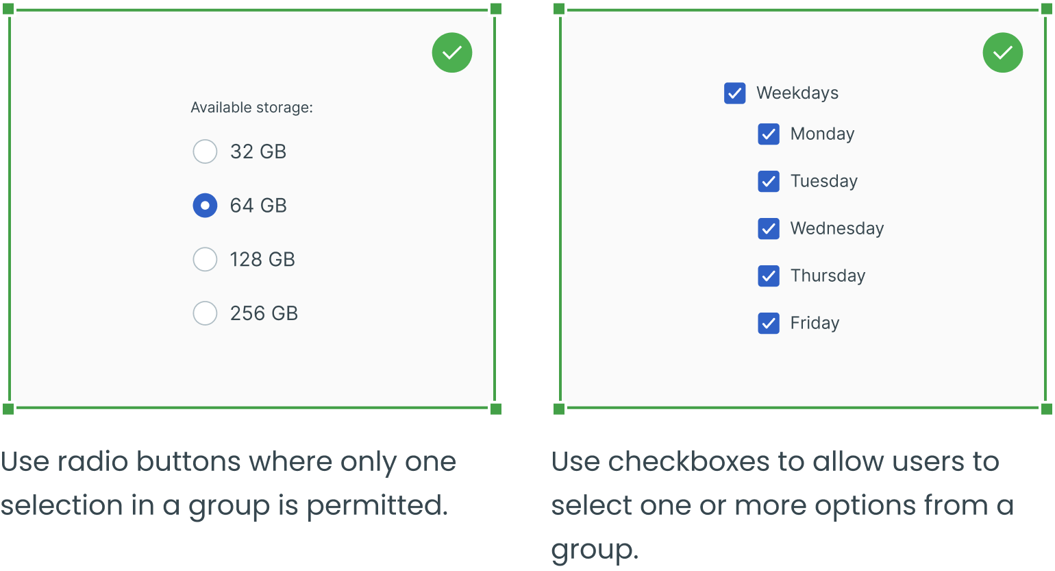
Checkbox vs. Radio Button
A Standalone Checkbox Can Replace a Radio Button
Use a Standard Visual Representation

Visually Present Groups of Choices as Groups
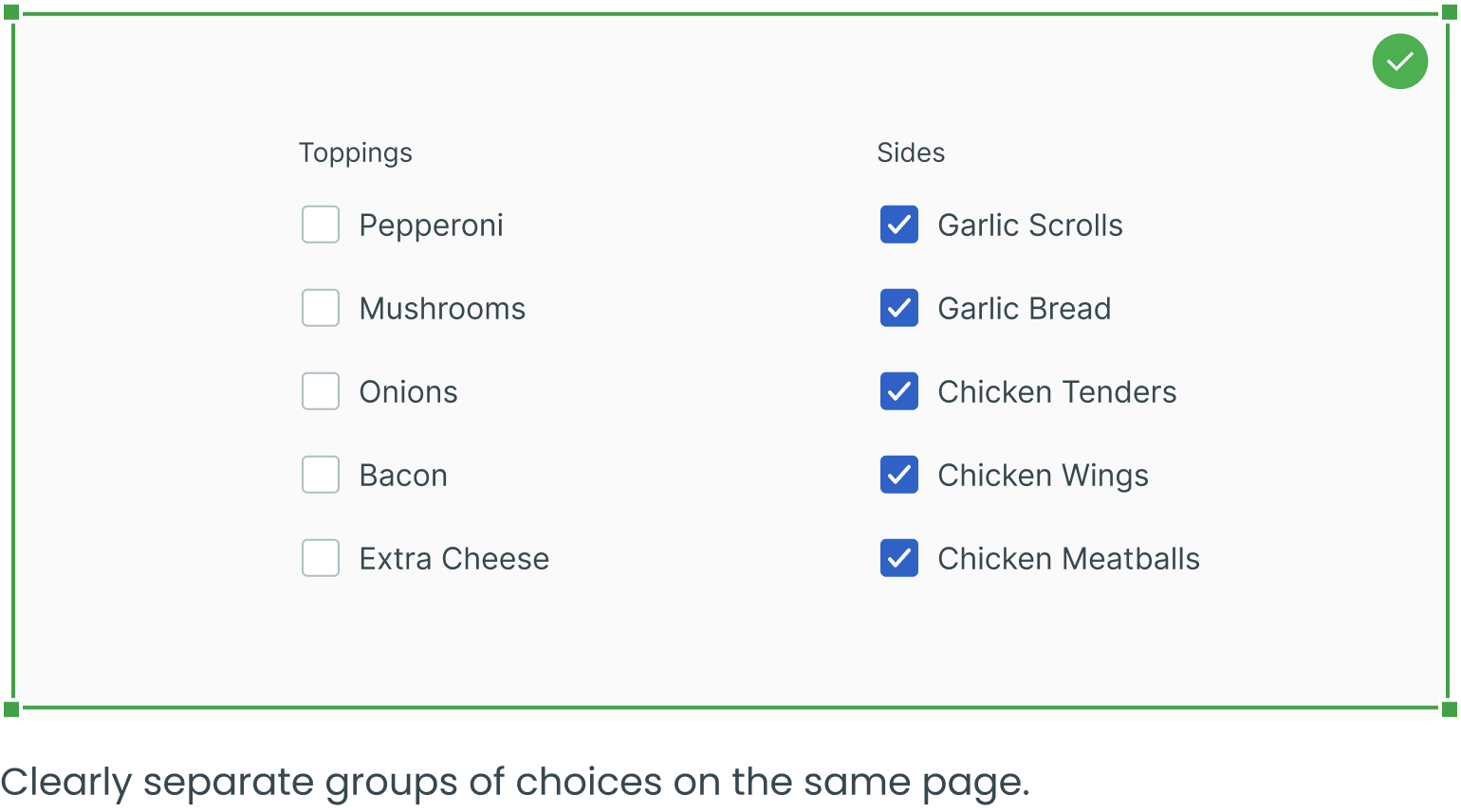
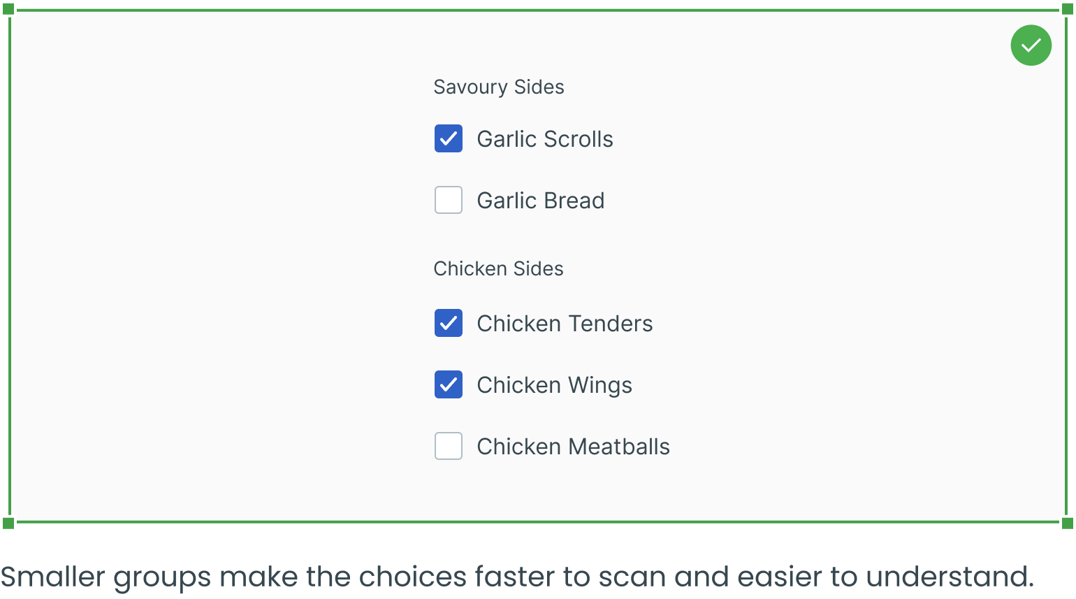
Use Texts to Break up Long Lists of Checkboxes Into Groups
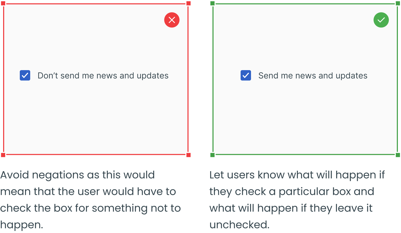
Use Positive and Active Wording
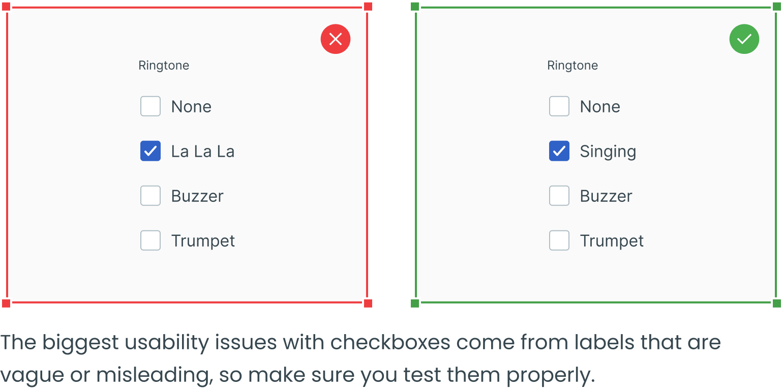
Avoid Misleading Wording
Link to Extra Information

___________
Text fields, dropdowns, radio buttons and forms are four other essential user interface elements you should be familiar with in addition to checkboxes.
Check out the rest of the series for more information on each design element, as well as guidelines for their use:


