Dos and Don’ts of Product Design: Badges

You pick up your phone and spot a little red dot—5 unread messages, 12 missed notifications. A tiny number that somehow makes you feel behind on life. Badges might be tiny, but they know how to steal the spotlight. In today’s notification-filled world, they’re always there, waiting to be noticed. The second you see an unexpected number, you just have to check.
A well-designed badge should do one thing well: communicate important information at a glance. But when they’re too aggressive, too vague, or everywhere at once, they stop being helpful. Instead of guiding users, they get ignored.
We’ve already covered Dialogs and Switches—now it’s time to talk about Badges. In this final part of our Do’s and Don’ts of Product Design series, we’ll explore how to use badges effectively. Let’s dive in.
Badges: When and How to Use Them
Badges are everywhere, from social media notifications to unread email alerts. They highlight notifications, status changes, and item counts, making it easier to stay on top of things.
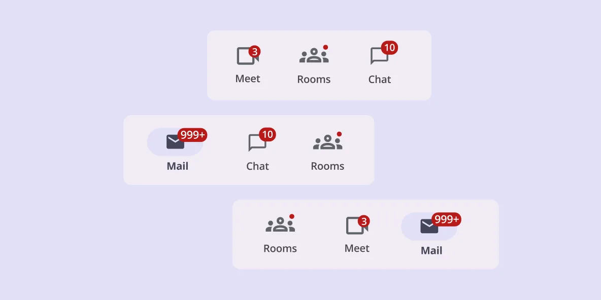
There are two types of badges, each with a clear role. A small badge is simply a dot used to show that something is new, like an unread message. A large badge contains numbers or short labels, giving users more detail. It might display how many unread emails are waiting or how many items are in a shopping cart.
To be effective, badges should always be placed in familiar locations. They appear on the upper edge of icons, making sure they’re easy to spot without blocking other content. Navigation bars, top app bars, and tabs are the best places for them.
A well-designed badge disappears once the user interacts with it. This keeps the interface clean and ensures the information remains relevant. When overused, badges create notification fatigue, making users more likely to ignore them.
The key is balance. If everything has a badge, none of them feel important anymore. A good badge should feel like a helpful signpost, not an endless to-do list.
1. Color
Do: Stick to the default badge color so it stands out against icons, labels, and navigation items. These colors are designed to be easy to notice and meet accessibility guidelines.
Don’t: Avoid picking custom colors that make badges hard to read or blend into the background. If a badge doesn’t stand out, users might miss important updates completely.
Badges should draw attention without being intrusive. If they blend into the background, they lose their purpose.
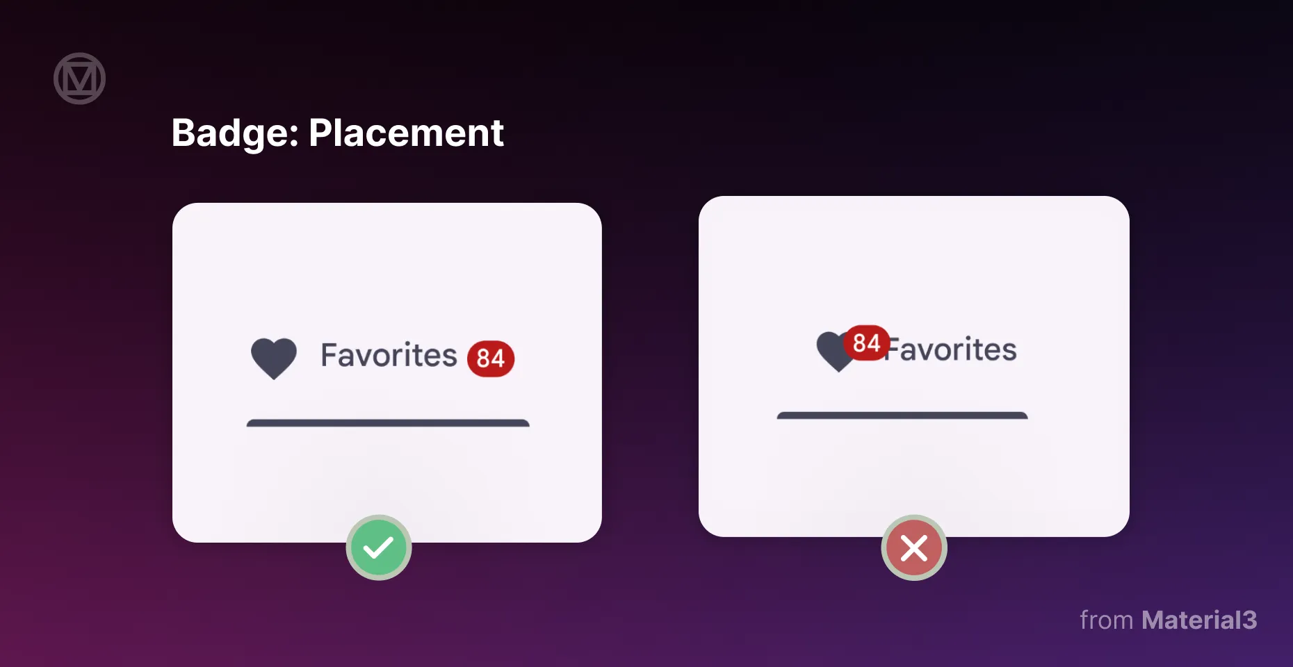
2. Placement
Do: Place badges at the end of icons and navigation items, where they’re easy to spot. If there’s enough space, use a large badge to show numbers more clearly, like in a navigation drawer.
Don’t: Avoid putting badges too close to other elements or in tight spaces where they might get cut off. In smaller areas, like a top app bar, use a small badge instead.
Badges work best when they are easy to spot without getting in the way. If they cover something important, they’ll cause more problems than they solve.
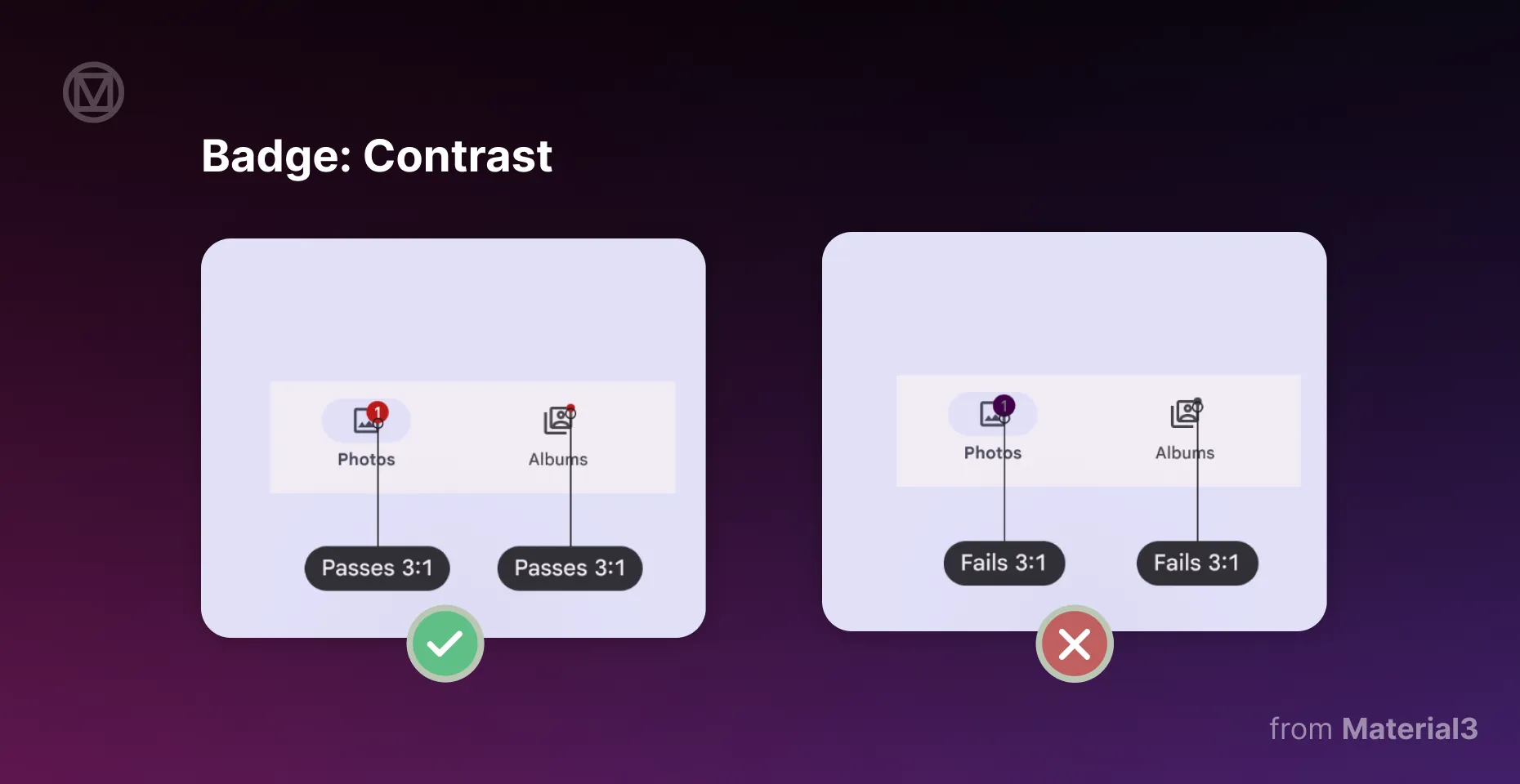
3. Contrast
Do: Make sure badges have strong contrast against the background, icons, and text. This ensures they are easily noticeable and meet accessibility guidelines.
Don’t: Avoid low-contrast colors that don’t pass the 3:1 contrast ratio. If a badge is too faint, users might not even realize it's there.
Badges are meant to catch the eye, not disappear into the interface. If they fade into the background, they lose their purpose.
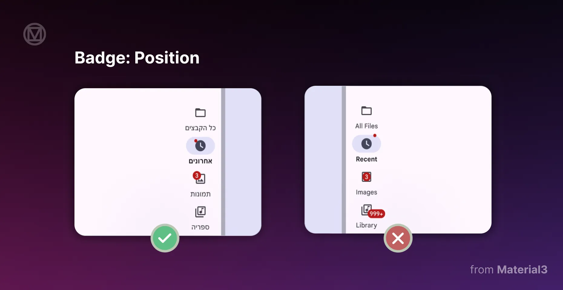
4. Position
Do: Keep badges inside the icon area so they stay in place. If your app supports right-to-left languages, make sure badges shift to the correct side to match the layout.
Don’t: Don’t place badges randomly or over important parts of an icon. They should add information without covering key details.
A well-positioned badge should feel like a natural part of the design. If users have to guess what it belongs to, it’s in the wrong spot.
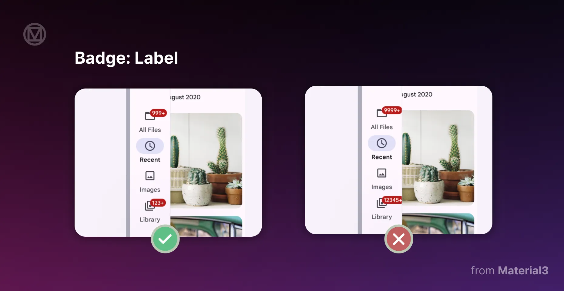
5. Label
Do: Keep badge labels short and simple. Use a large badge when showing numbers, but limit text to four characters. If the number is too big, round it up with a “+” (like “99+”).
Don’t: Don’t let badge labels overflow, get cut off, or collide with other UI elements. Overcrowded badges look messy and defeat their purpose.
Badges should give quick information. If users have to stop and figure it out, the design needs fixing.
Badges are part of how we interact with apps every day. If you're building an app or a website, they can make a huge difference in how users engage with your product.
That’s why placement, color, contrast, position, and labels are worth a second look. If you ever wonder whether a badge is working as it should, make sure it is aligned with the above-described five key areas.
Just like Dialogs and Switches, Badges remind us that good design is often about knowing when to hold back. And one thing is clear: designing small UI elements takes just as much thought as the big ones!