Dos and Don’ts of Product Design: Switches


A great product experience isn’t just about big features—it’s the small details that make it feel effortless. The tiniest elements, like dialogs, switches, and badges, can shape an entire UX. That’s why we’re continuing our mission to keep those details in check.
After going down the rabbit hole of dialog design, we’re now flipping the switch, literally. Next up in our Dos and Don’ts of Product Design series: Switches
Switches: When and How to Use Them
At first glance, they seem simple, flip it on, flip it off. But we’ve all seen (and used) switches that make us stop and think: Wait, is this on or off? Did that actually do anything?
A badly designed switch can confuse users, cause mistakes, or make an interface feel clunky. The good news? Most switch design mistakes are easy to avoid with a few simple rules.
Unlike checkboxes and radio buttons, switches are meant for binary actions. So use them for things that are either on or off, active or inactive.
A good switch gives users instant feedback, doesn’t require an extra confirmation step. Also it makes it clear which state is selected at a glance. But not all switches are created equal. There are plenty of common mistakes that can make them more frustrating than functional.
That’s why we’re breaking down the do’s and don’ts of switch design, covering key areas like: opposite options, multiple options, single vs. multiple choice, icons, and label text.
Let’s get into it:
1. Opposite Options
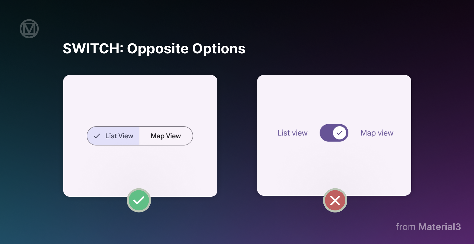
Do: Use segmented buttons when users need to choose between two opposing options, like switching between list view and map view. Segmented buttons make it clear that selecting one option disables the other.
Don’t: Use switches to toggle between two opposite options. A switch is meant for binary states (on/off, enabled/disabled), not mutually exclusive choices. Users might expect both options to be active or inactive at the same time, leading to confusion.
If users can only select one option, don’t make them guess. Rather use a more intuitive selection method like segmented buttons.
2. Multiple Options

Do: Use checkboxes when users need to select multiple options in a list. Checkboxes clearly show which items have been chosen while allowing for flexible selection.
Don’t: Use switches for multiple selectable options in a list. Switches should not replace buttons or act as a call-to-action. People expect switches to toggle an individual setting, not perform batch selections.
If users need to select multiple things before confirming their choice, checkboxes or action buttons work better.
3. Single / Multiple Choice
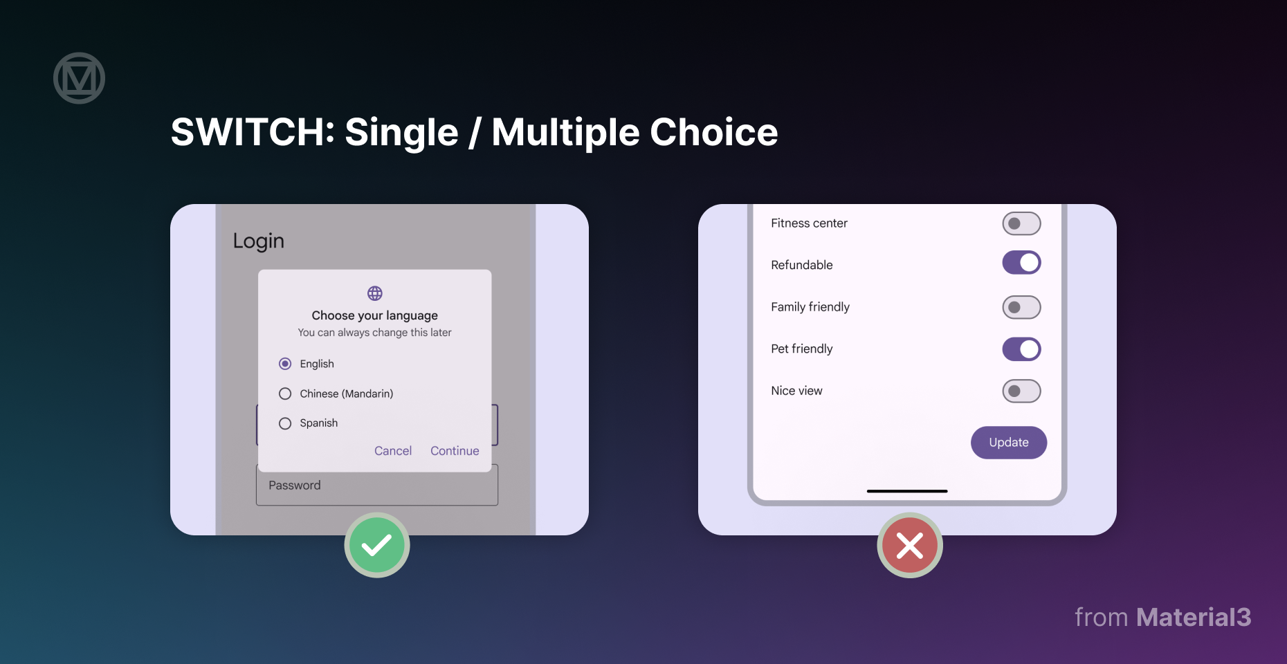
Do: Use radio buttons when the user can select only one option from a list. Radio buttons show that choosing one option deselects the others.
Don’t: Use switches when multiple settings require confirmation before taking effect. Switches should apply changes immediately, without requiring a "Save" button. If users must select and confirm their choices, radio buttons or dropdowns are better options.
A switch should be a quick, instant toggle, not part of a multi-step decision process.
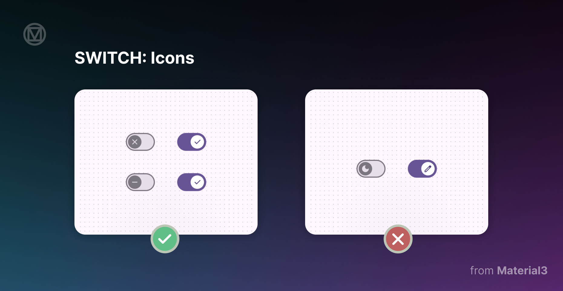
4. Icons
Do: Use icons inside the switch handle when they help communicate the state of the switch. A checkmark for "on" and an "X" for "off" makes it clear what’s happening.
Don’t: Use icons that don’t clearly represent the toggle state. Symbols like a moon, pencil, or random UI icons can make users second-guess what the switch actually does.
If an icon doesn’t instantly tell the user what’s enabled or disabled, it’s better to leave it out altogether.
5. Label Text
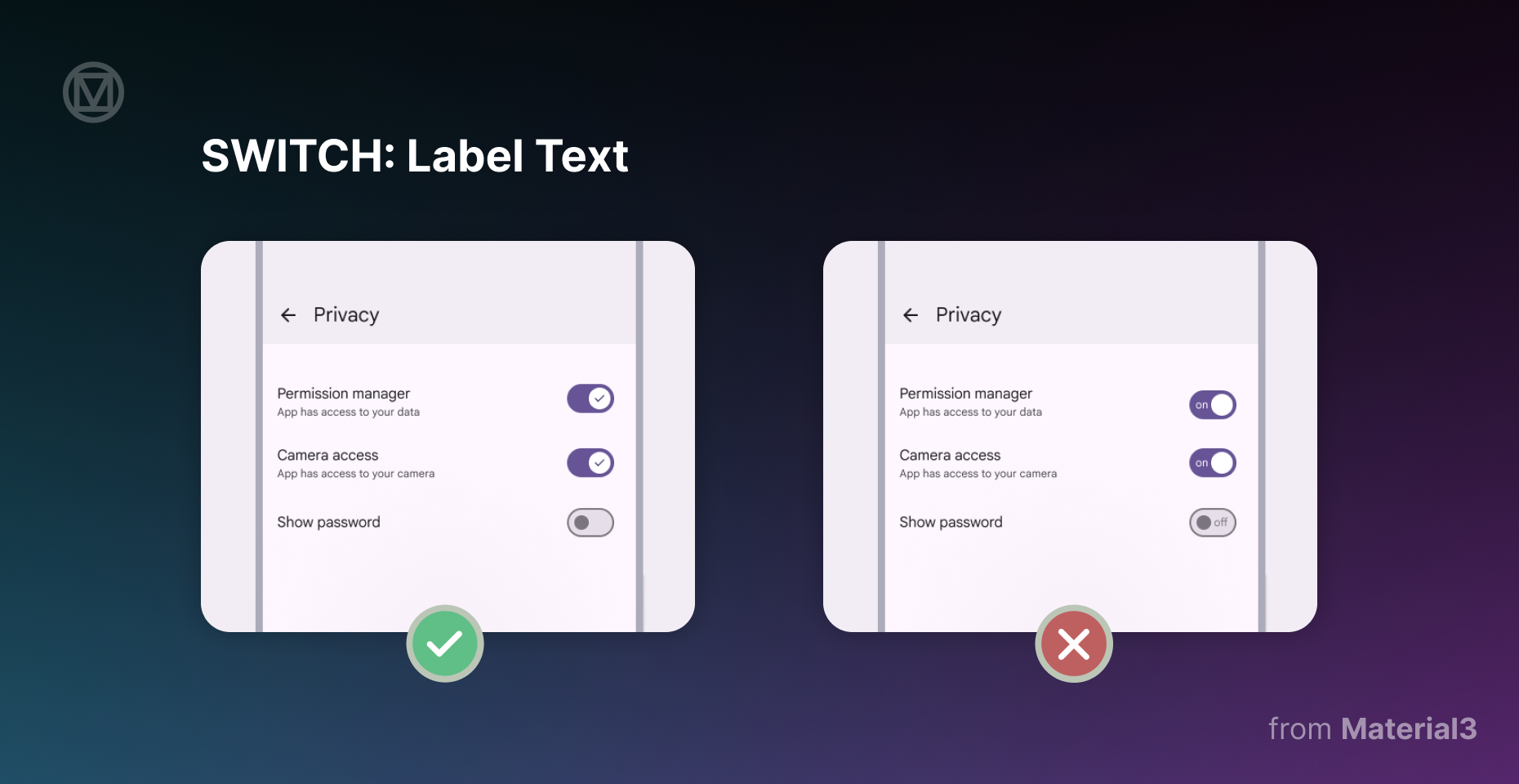
Do: Pair every switch with a clear label that describes what happens when it’s turned on. Keep labels short and action-oriented, like "Enable notifications" or "Dark mode on".
Don’t: Place text inside the switch itself or use long, unclear labels. The font would be too small to be readable, making accessibility a problem. Also, avoid labels that describe both states at once, like "On/Off".
A good label should tell users what the switch does when turned on, not force them to guess.
Switches should be the least complicated part of an interface.
Flip it on, flip it off, that’s it.
When designed poorly, they leave users second-guessing their choices.
The key is to keep things simple. If a switch makes someone hesitate, it’s not doing its job. Stick to binary actions, use clear labels, and make sure the user always knows what’s on and what’s off.
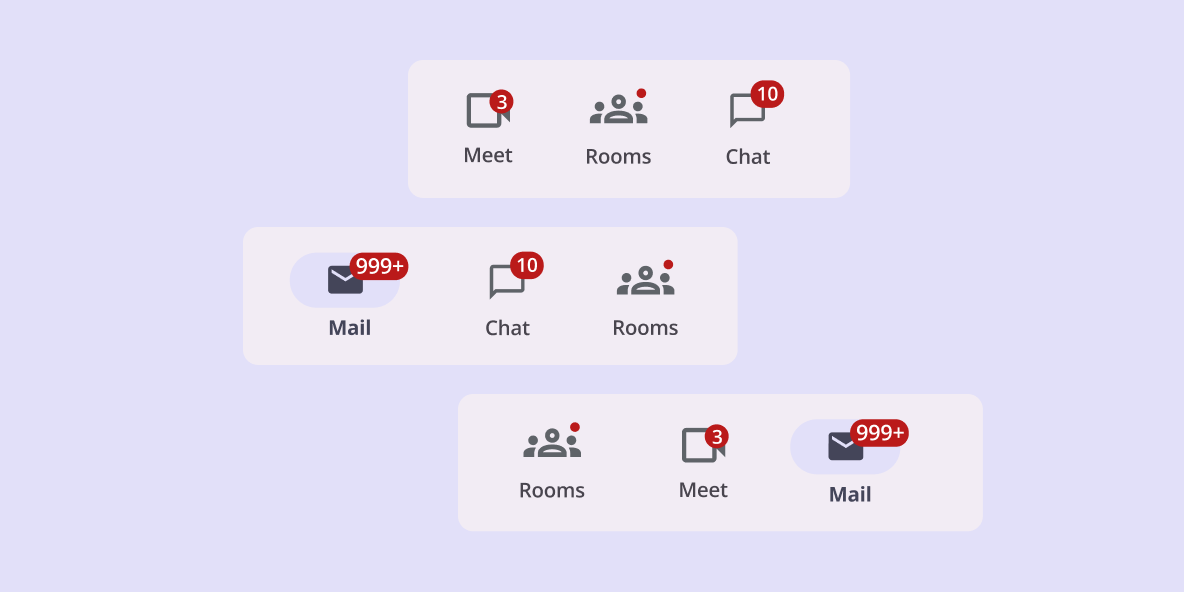
With switches checked off, we’re moving on to the next piece of the puzzle, badges. These UI elements help users stay informed, but only when they’re used the right way.
Stay tuned for the next part of our Do’s and Don’ts of Product Design series!

